
For the better part of a decade, the digital design landscape has been obsessed with hygiene. We stripped away shadows. We flattened buttons. We chased a “clean” aesthetic so aggressively that websites began to feel like sterile operating theatres rather than inviting brand homes.
But as we settle into 2026, the pendulum is swinging back. We are witnessing a massive aesthetic pivot that industry leaders are calling “The Tactile Revival.”
If you have noticed that the most forward-thinking brands on your feed are suddenly embracing blur, grain, and handwritten scrawls, you are not imagining it. This is not just a stylistic choice. It is a strategic response to the saturation of Artificial Intelligence.
As AI tools become capable of generating increasingly flawless visuals, “perfection” is becoming a commodity. It is cheap. It is easy to replicate. And consequently, it is starting to feel untrustworthy.
To stand out in 2026, it is no longer enough to offer high-quality visuals. You must offer visuals that feel human.
The Psychology of Imperfection
Why is this shift happening now? The answer lies in the “uncanny valley” of modern content creation.
When a potential client scrolls through Instagram or visits a website, their brain is making split-second judgement calls about trust. For years, a polished, high-resolution image signalled professionalism. It meant you had the budget for a studio photographer and a retouching team.
Today, however, a flawless image often signals “synthetic.”
Audiences are craving visuals that possess a human, crafted feel. This movement prioritizes authenticity over perfection. We are seeing brands deliberately integrate analogue textures to signal originality and human intent.
When a user sees a photo with slight motion blur or a background with film grain, their subconscious registers it as a captured moment rather than a generated file. It signals that a real person was present. In an era of deepfakes and mass-generated content, these “flaws” have become the new premium. They are the watermarks of reality.
Here is a deep dive into the three specific pillars of the Tactile Revival and how you can leverage them to build a brand that feels established, expensive, and real.
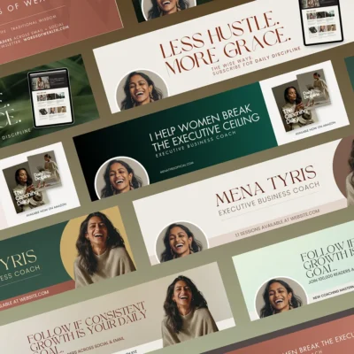
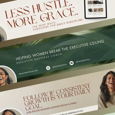
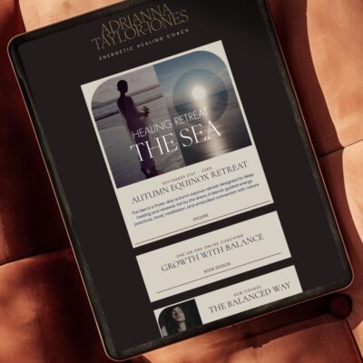
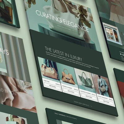
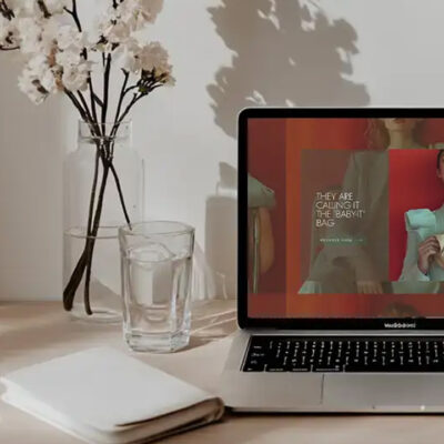
1. The “Camera Roll” Aesthetic
The most visible shift is in photography. We are moving away from studio-perfect lighting and staged compositions toward natural, unposed lifestyle imagery.
This trend mimics the “camera roll” snapshot. It includes movement blur, soft shadows, and authentic environments. It is about capturing a fleeting moment rather than staging a product for a catalogue.
This presents a unique challenge for founders. How do you remain professional while avoiding the “synthetic” look that erodes trust?
The key is strategic imperfection.
We are seeing a move away from the “corporate handshake” stock photos of the 2010s. Instead, luxury brands are using imagery that feels voyeuristic and candid. The lighting is often ambient rather than artificial. The focus might be slightly soft. The subject might be looking away from the camera.
This aesthetic works because it invites the viewer into a narrative. A perfect photo is something you look at. A candid, tactile photo is something you feel like you are in. It allows the viewer to imagine themselves in the scene rather than just observing it from the outside.
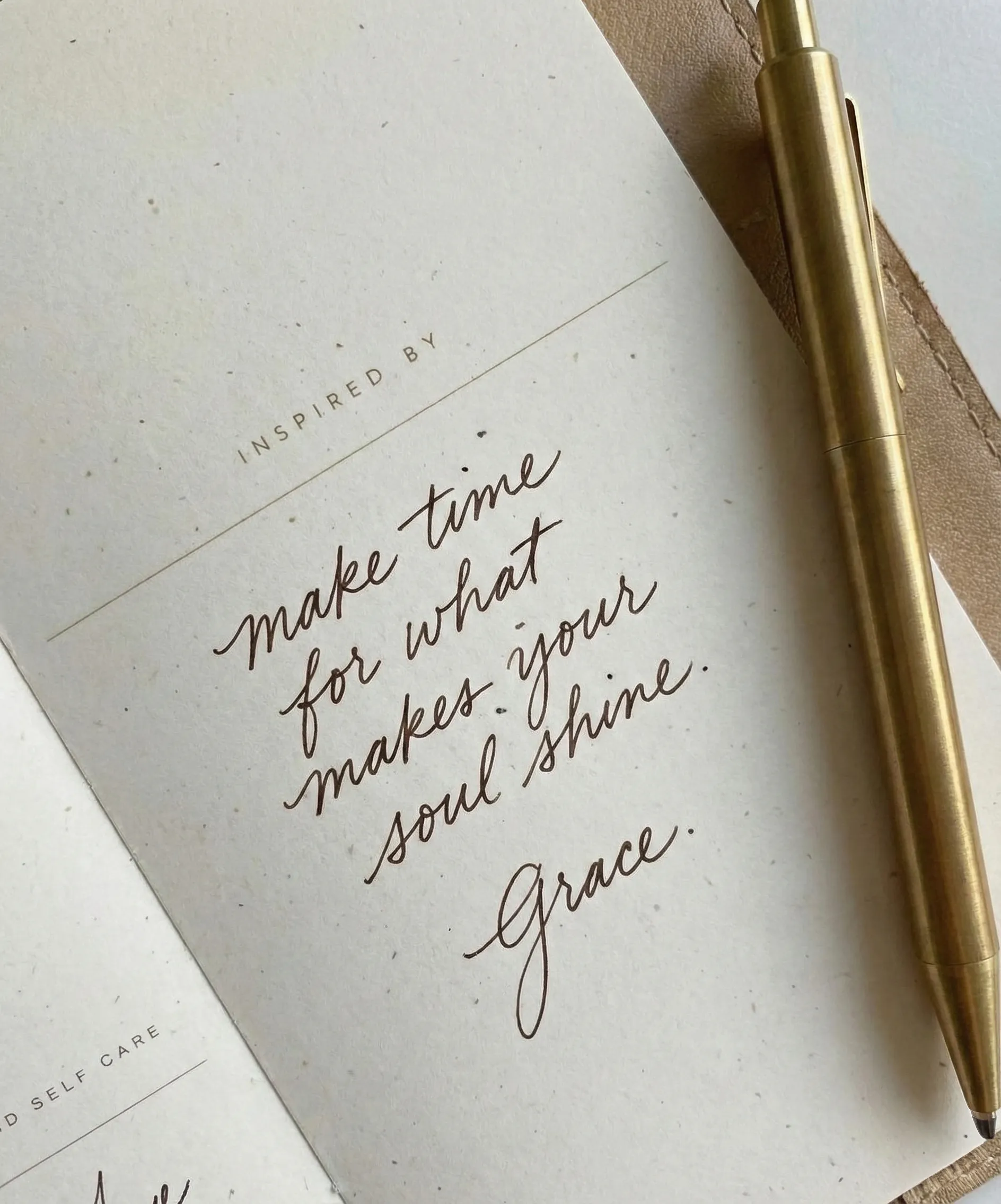
2. The Typographic Handshake
Visuals are only half the story. The other half is how you speak. Or rather, what your voice looks like.
For years, digital brands relied on safe, geometric sans-serif fonts. They were clean, legible, and universally compatible. But they were also cold. Now, we are seeing a distinct shift in typography that mirrors the tactile revival.
We call it The Typographic Handshake.
This involves pairing a primary, authoritative typeface with a secondary, handwritten-like script. This is not the curly, decorative calligraphy of wedding invitations. It is the scratchy, quick signature of a human hand.
Brands are using these handwritten elements as “emotional accents”. You might see a corporate header in a bold serif font, annotated with a circled word or an arrow drawn in a marker style.
This technique breaks the rigid digital grid. It creates an immediate sense of intimacy. It makes a brand feel approachable and grounded rather than distant and corporate. It subconsciously tells the reader: A human reviewed this. A human highlighted this for you.
However, restraint is required. If everything is handwritten, it looks amateur. If everything is rigid, it looks robotic. The luxury lies in the balance. The clean font provides the logic, while the handwritten element provides the humanity.
3. Digital Dust: Grain and Noise
The pursuit of imperfection extends to the surface of the digital screen itself. We are seeing a return to film grain, paper textures, and digital noise.
Instead of the sterile, flat colour gradients that dominated 2024, designers are adding “digital dust.” This subtle noise adds depth and a sense of physical history to digital backgrounds. It creates a “haptic” visual experience—design you feel like you could touch.
Why add noise to a crisp digital screen? Because it grounds the brand in the physical world.
We associate texture with premium materials—thick cardstock, linen, film negatives. By applying these textures digitally, brands transfer that association of physical quality to their online presence. It creates a sense of “history” and permanence that flat pixels lack.
This is particularly effective for service providers, coaches, and consultants. Your business is intangible. You sell advice, strategy, or transformation. By using tactile textures in your branding, you make your service feel more substantial. You give weight to your words.
How to Execute This Without Looking “Messy”
There is a fine line between “editorial imperfection” and “messy design.” One signals high-end authenticity; the other signals amateur DIY.
To execute the Tactile Revival successfully, you must maintain the principles of visual hierarchy and white space.
1. Keep the Foundation Clean You cannot layer noise, blur, and handwriting over a cluttered layout. The underlying structure of your website or social graphic must be rigorous. Use generous white space to let the textures breathe. The “messiness” should be a garnish, not the main course.
2. Audit Your Imagery Look at your current visual library. Do your images look like they came from a glossy stock site, or do they look like they came from an artist’s camera roll? If your feed feels too polished, it might be time to introduce some “quiet luxury” visuals that feel more lived-in.
3. Use Consistency to Build Trust If you decide to adopt the “Typographic Handshake,” use the same handwritten font every time. If you use film grain, apply the same level of opacity across all your posts. Consistency builds brand recognition. Randomness lowers perceived value.
The Business Case for Being Real
Ultimately, this trend is not just about aesthetics. It is about conversion.
In 2026, the brands that win will be the ones that build the fastest emotional connection. We are all tired of the hard sell and the perfect facade. We want to buy from humans.
When you embrace the Tactile Revival, you are signaling that your brand has nothing to hide. You are confident enough to be “real.”
You do not need to hire a film photographer or learn complex design software to achieve this look. We designed our Quiet Luxury and The Tactile Edit stock collectionsspecifically to solve this. We curated these sets to provide that editorial, textured aesthetic that feels expensive but authentic.
They are built to stop the scroll by feeling real rather than manufactured.
One week of focus is all it takes to realign your brand with the 2026 aesthetic. We have built the tools so you can spend less time decorating and more time building your legacy.
Explore our Stock Collections